Linq Midtown is an apartment complex in Sacramento, CA. As a faux client I wanted to work through what I would do to better their brand, compared to what they are currently doing. Again, this is a side project for fun and exploration, not an actual project or client.
Starting with their logo, I wanted to brighten things up and give them more of a modern, fun, trendy looking logo to better reflect the apartment complex itself with its fun amenities, and trendy location.
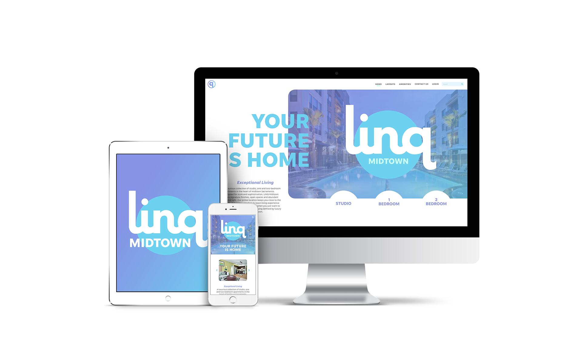
I then further worked through a printed piece and a full website UI to show how their brand could better target their potential residents.
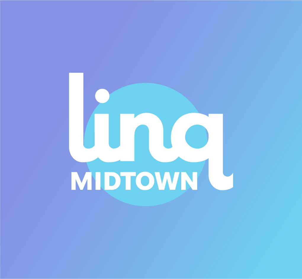
Linq Midtown Final Logo
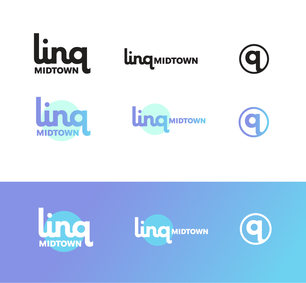
Final Logo Alternate Layouts / Colors
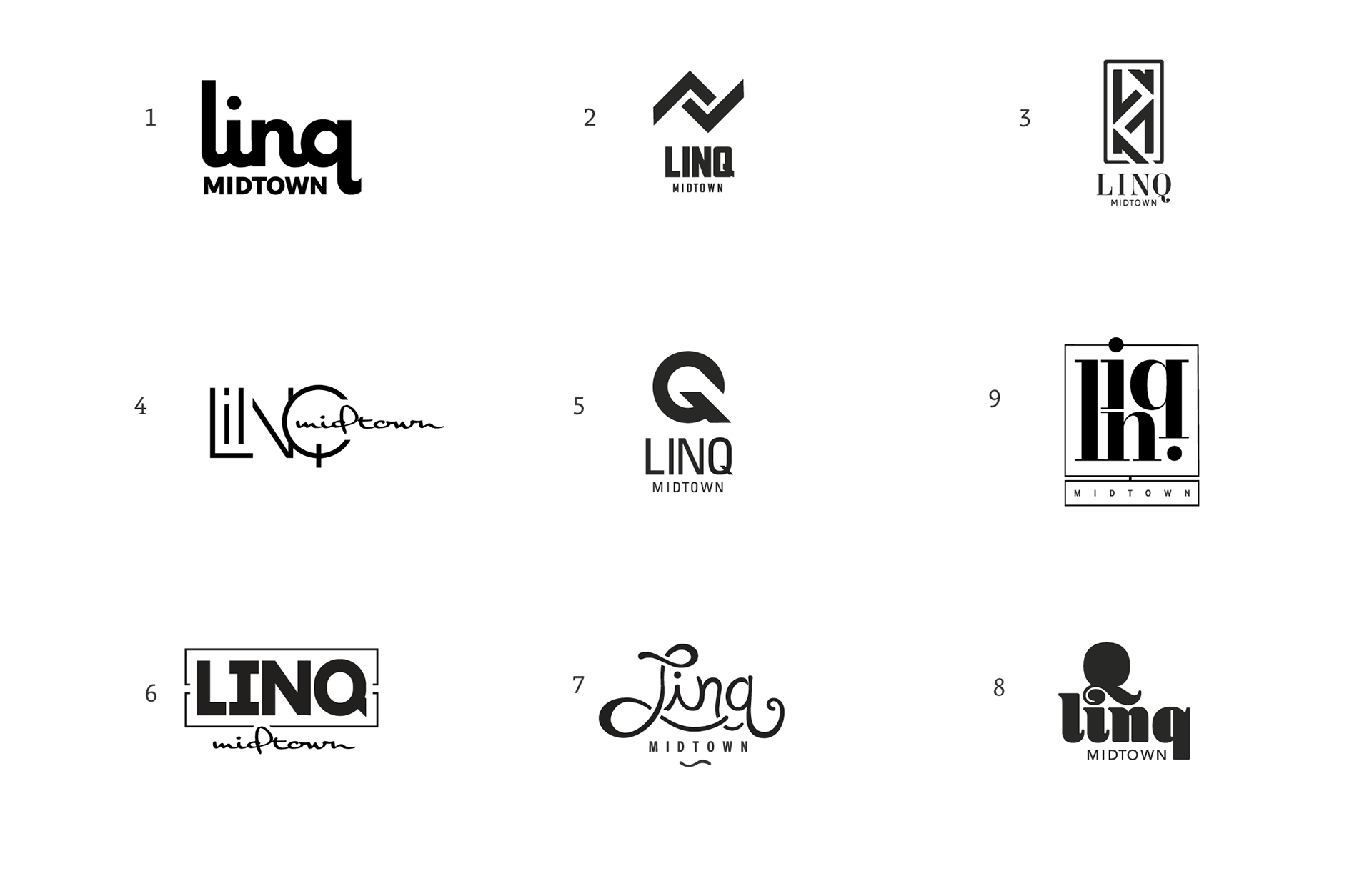
Linq Midtown Alternate Logo Ideas
Desktop Website UI
[created in Adobe XD]
[created in Adobe XD]

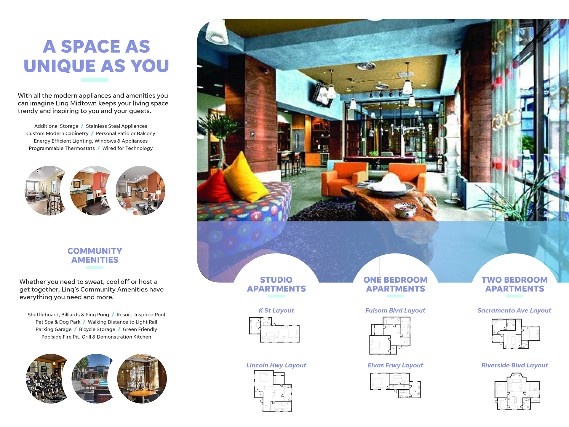
Top: Brochure Outside (panels listed from left to right : Inside Flap, Back Panel, Front Cover)
Bottom: Brochure Inside Spread