GOODRX
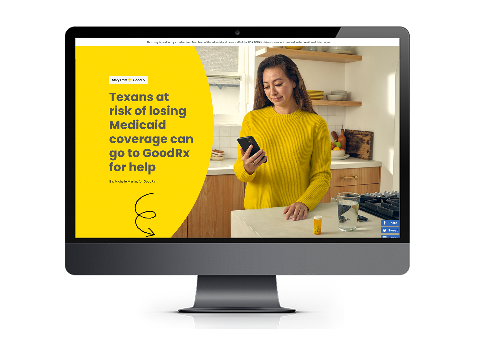
GoodRx came to us looking for an infographic that would help aid consumers in navigating the unwinding of Medicaid, which proved to be a lesson in adapting a design to better fit the clients wants. While initially the client had requested that the site be branded with GoodRx branding (of which yellow, black and light gray are the main colors), the client then provided hero art (TX and US graphics on orange version) that they requested to be used as is for the design of the page. After clarification that they would not like the page to be yellow forward and instead accent brand color forward (orange / pink) we got to work revising the page. While both versions of the page accomplish a goal this is a lesson that clear communication with a client during the design process is imperative to ensuring that they get the desired result.


Original Initial Design
Final Approved Design