Radiant Complexions is a Des Moines, Iowa based dermatology clinic, looking for both an update to their logo, and a new advertising campaign. The current logo was an acronym of RC set in a Times New Roman, with a sketch illustration of a profile of a woman to the left of it, only available in a horizontal version. Ads were focusing on doctor photos and not the customer enjoying their flawless skin.
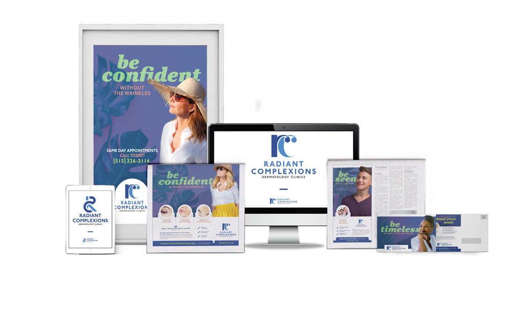
A new modern logo was developed, with the illustration removed and a bright, cheerful ad campaign was developed focusing on teenagers (riding themselves of acne), middle-aged women (smoothing wrinkles) and elderly (removing age blemishes.
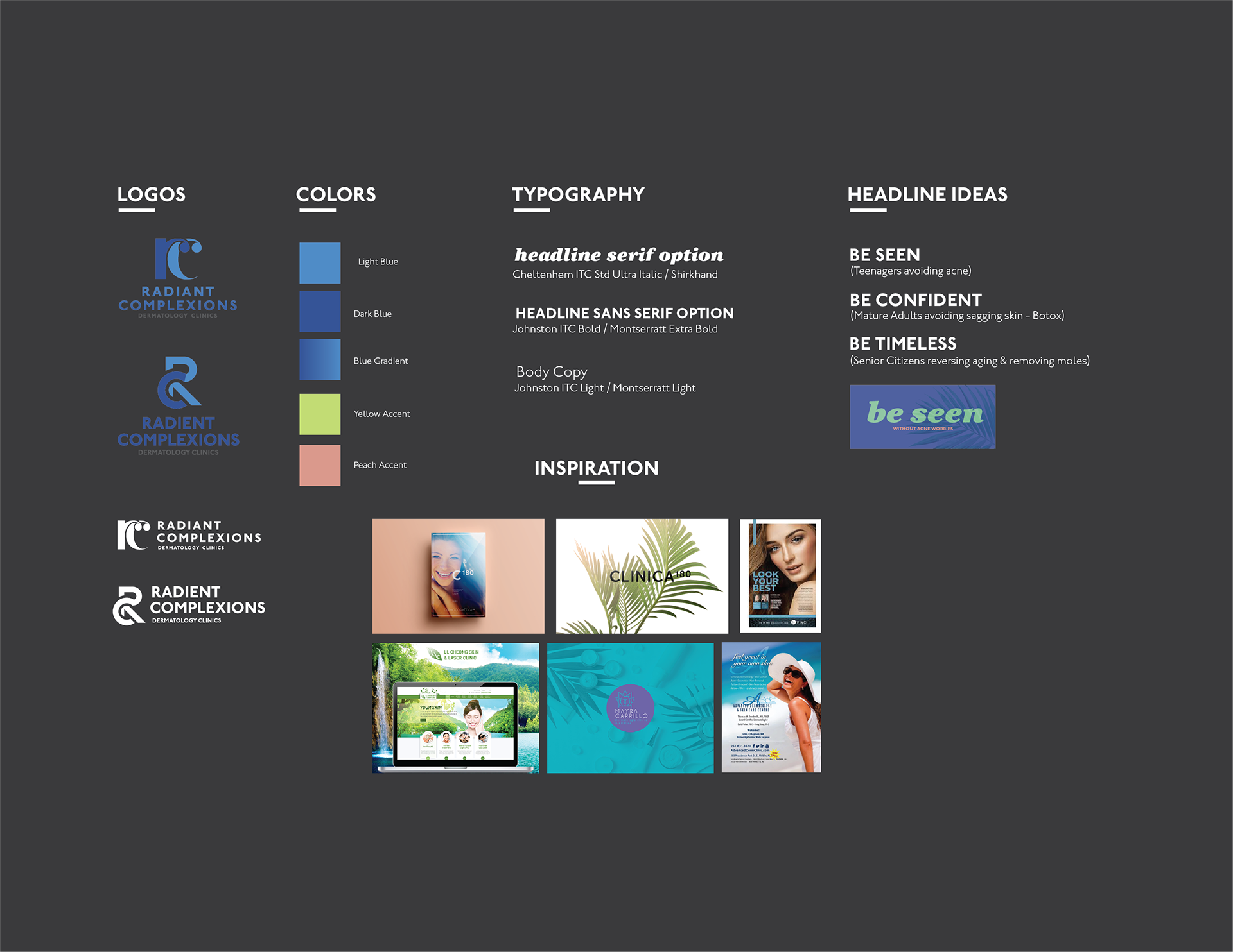
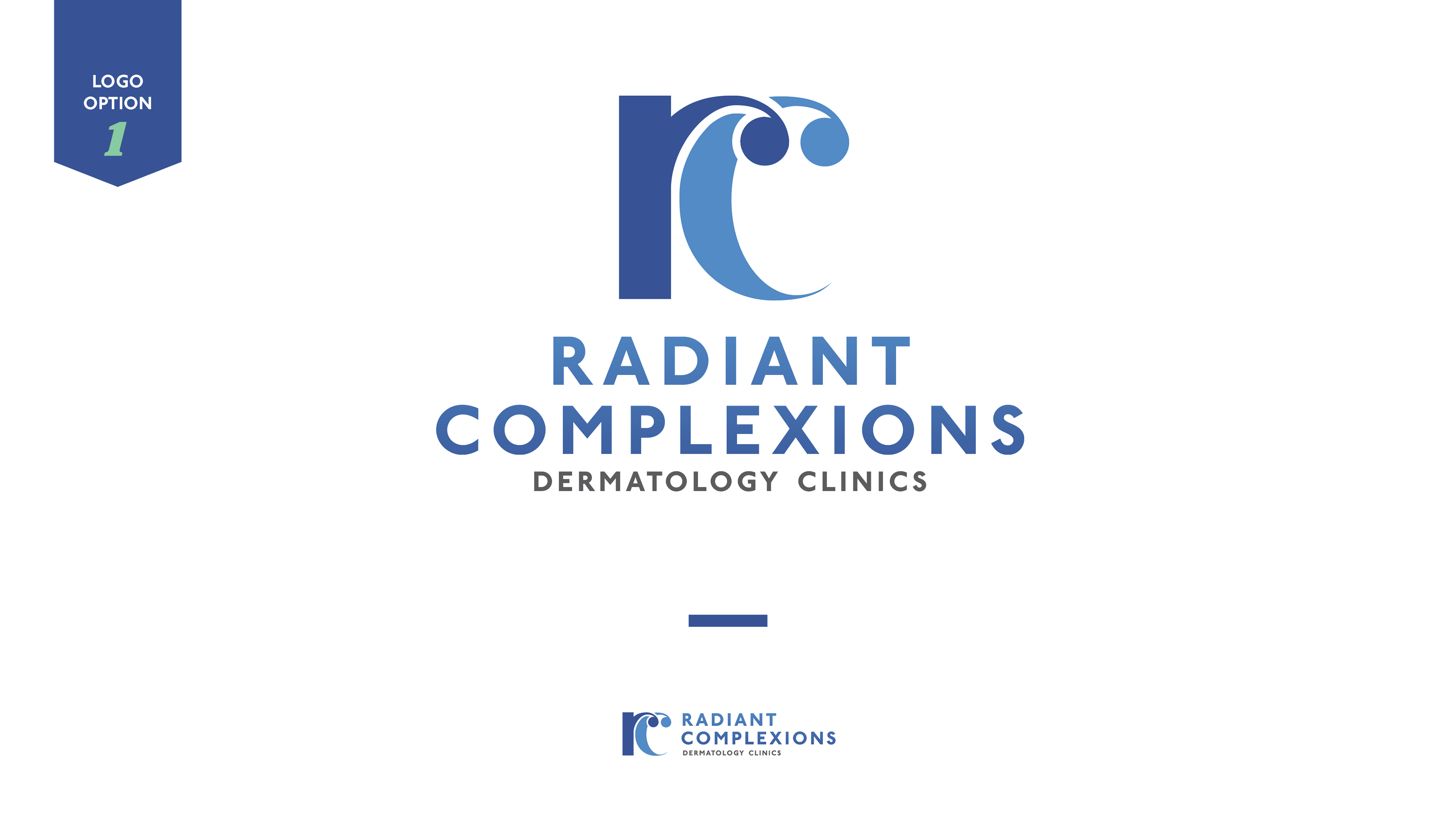
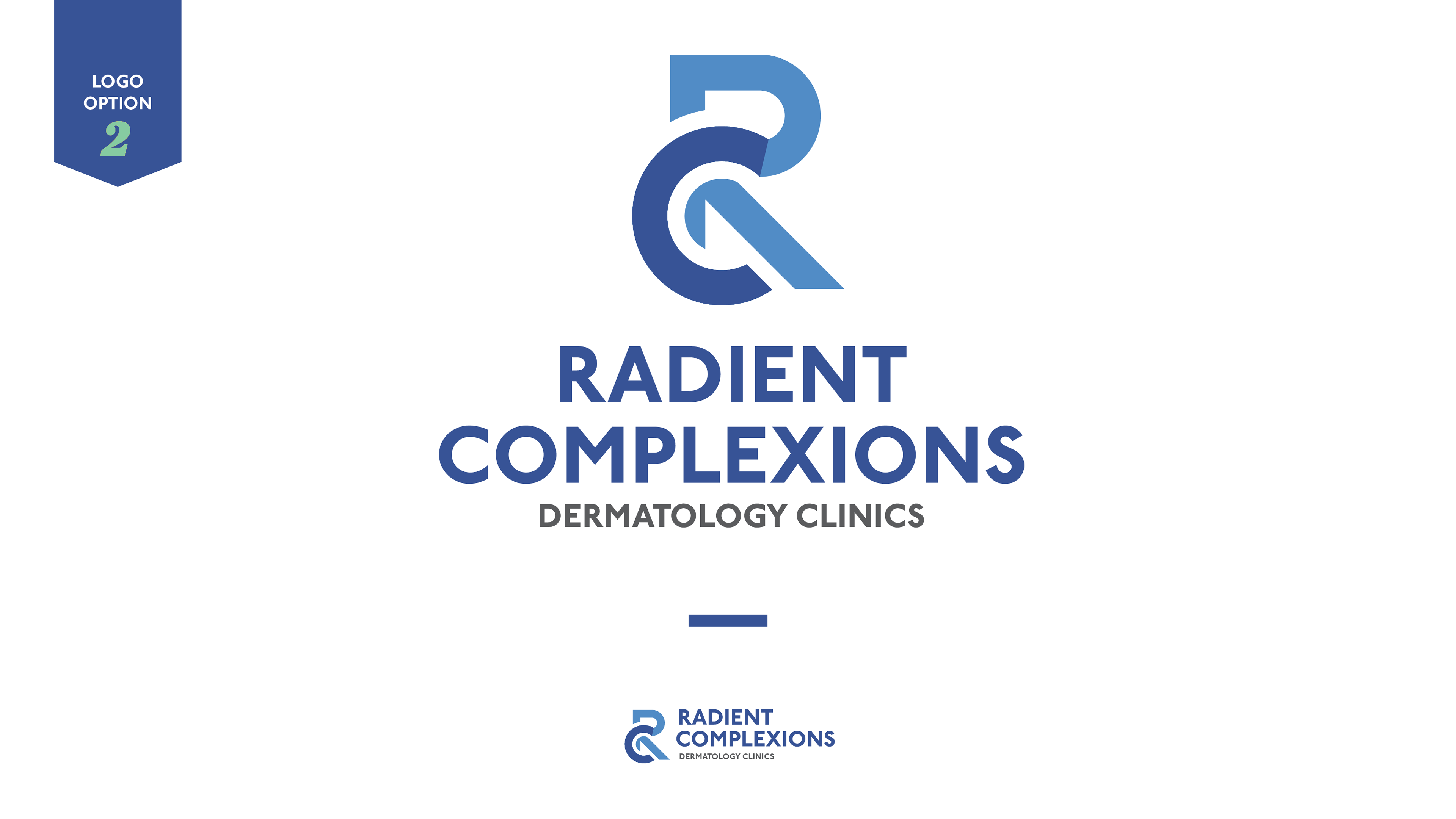
Logo options presented.
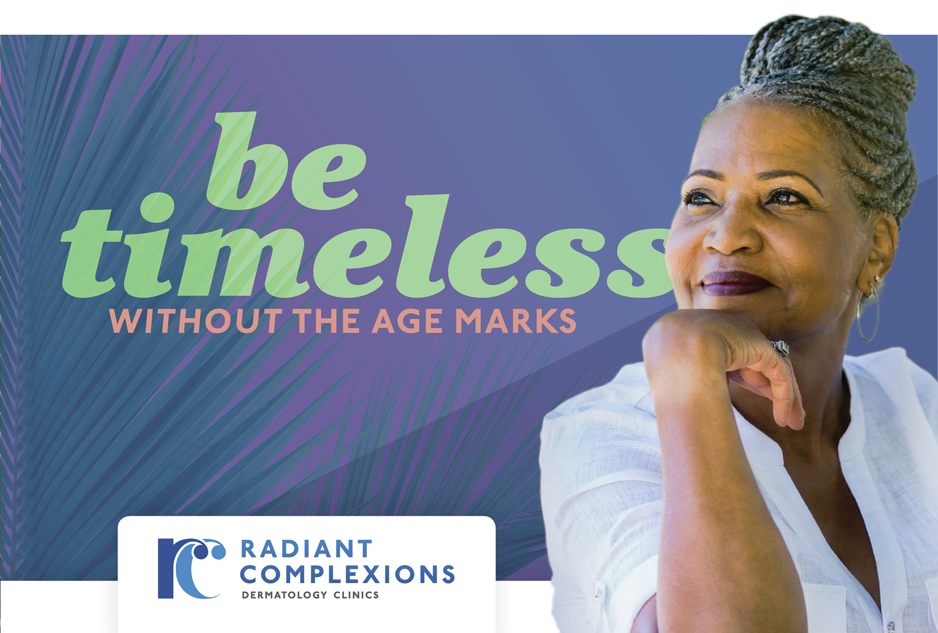
Direct Mailer Front (focusing on the Senior Women Target).
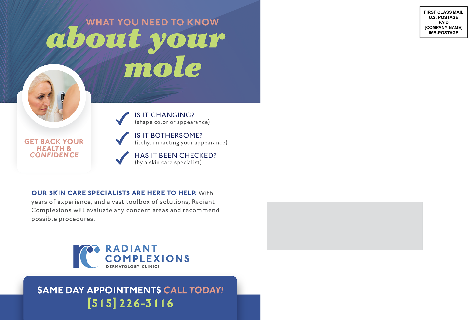
Direct Mailer Back.
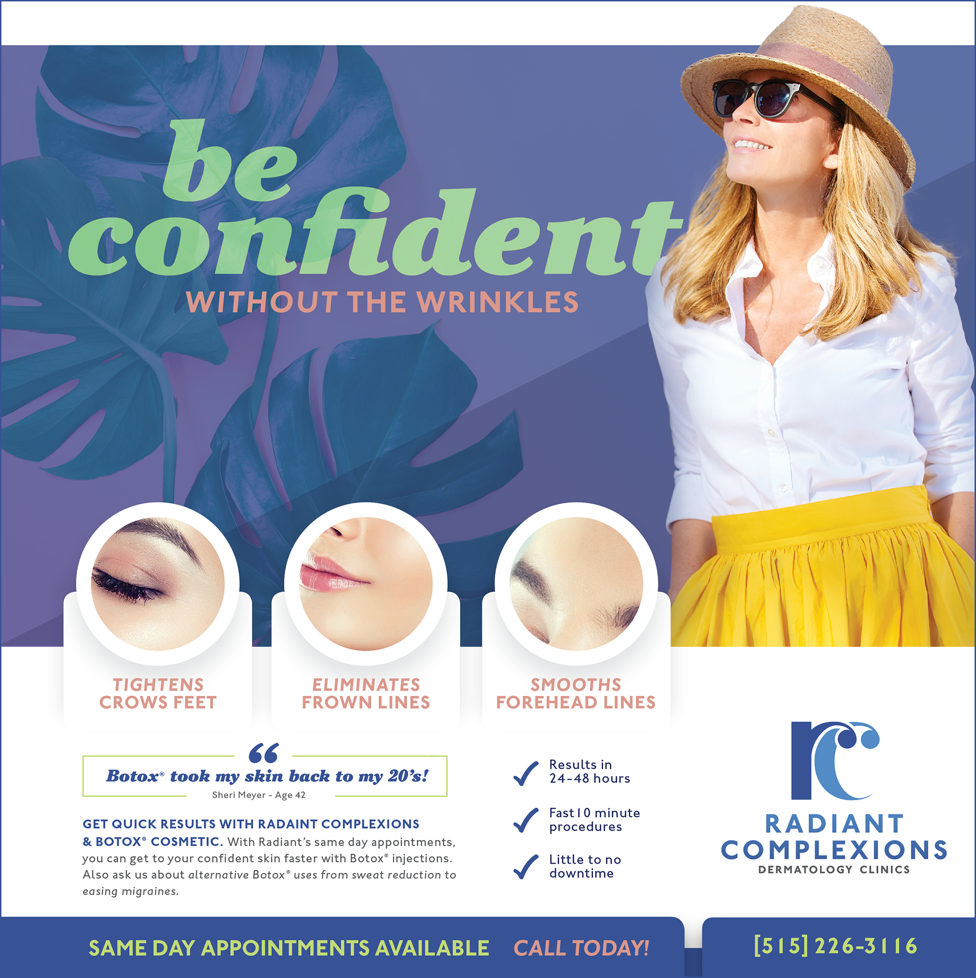
Newsprint Half Page focusing on Middle Aged Women Target.

Poster advertising for the local skywalk (focusing on the middle-aged target market).
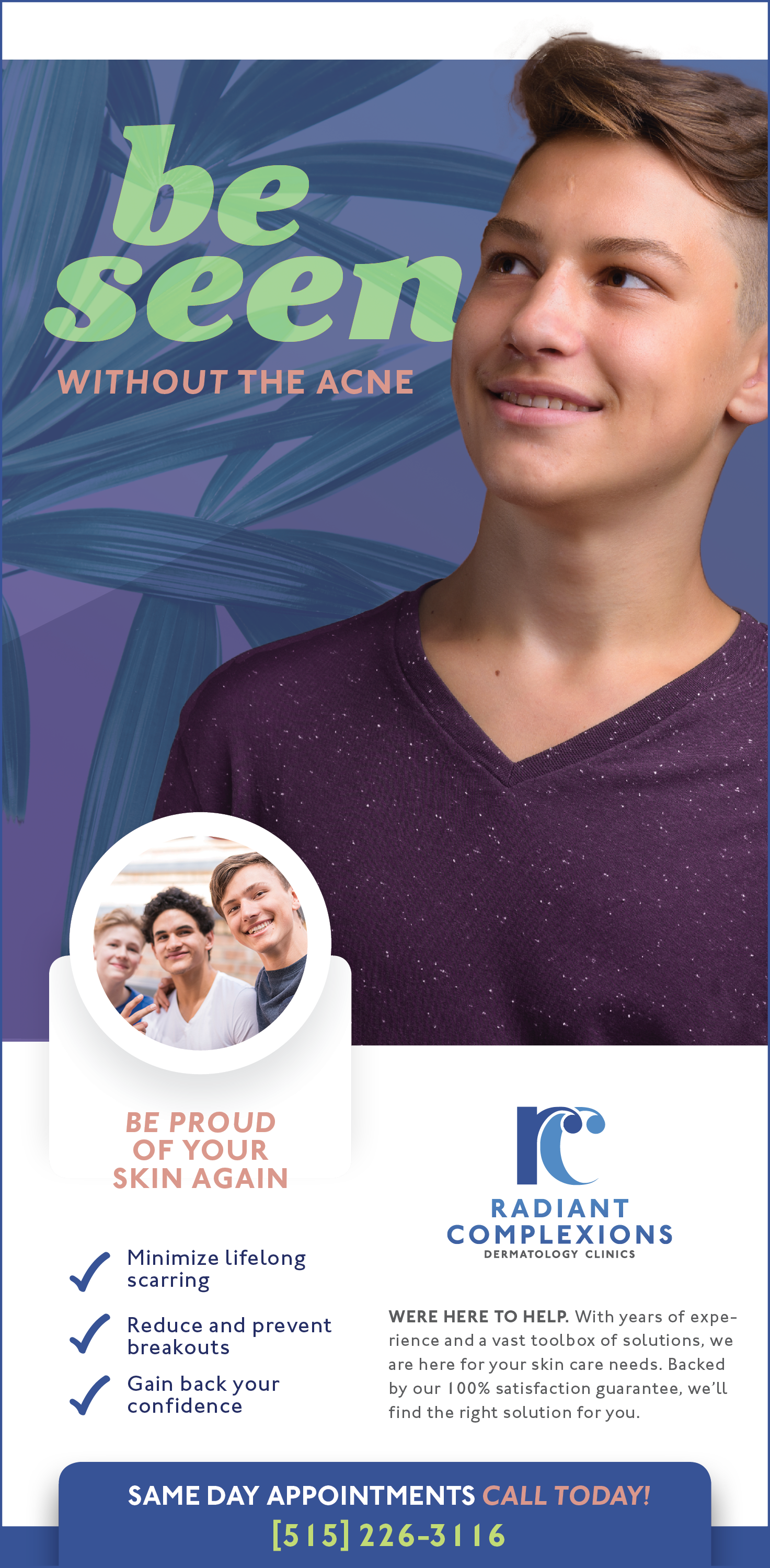
Newsprint Quarter Page focusing on the teenage target market.